
Decentralization Strikes Back

About two weeks ago, we joined the masses of people leaving Twitter for Mastodon. The fact that Mastodon, building on some earlier ideas for federated social networking, is a decentralized approach, has renewed our interest in, and hope for, the decentralization of the Internet.
When Larry and I kicked off Systems Approach back in 2020, one of our first tasks was to brainstorm a list of books we’d be interested in writing. Two years later we’ve managed to bring three of those ideas to life, with books on SDN, Edge Cloud Operations, and TCP Congestion Control. But one book that remains on the to-do list has the working title “The Decentralized Internet”. We’ve managed a few posts on that topic (e.g., this, this, and this) but we’re still some distance away from having the material for a book. On top of that, the backlash against Web3 (quite justified in my view) cooled my enthusiasm somewhat. But there is definitely more to decentralization than Web3, with the rapid rise in popularity of Mastodon and the Fediverse an interesting case study.
There’s been a flurry of articles on the exodus from Twitter to Mastodon in both technical and mainstream publications. This article provides a solid introduction to the underlying technology, which is ActivityPub, a protocol specified by the World Wide Web Consortium (W3C). ActivityPub draws on a long line of research in publish-subscribe systems (of which this 1987 paper may be one of the first). This post by Bryan Cantrill made several good points about the benefits of decentralization as it applies to social media, including the increased opportunities for experimentation that arise when the operation of the social network is no longer the province of a single corporation. We’re seeing lots of experimentation with Mastodon deployment, data is being shared, and a range of different ActivityPub implementations beyond the canonical Mastodon server (e.g. GoToSocial, Takahe) are appearing.
It’s worth digging a bit deeper into what we mean by decentralization here. Twitter is not a monolith: it is a giant distributed system, made up of a large number of microservices. For example, here is a quote from a Twitter infrastructure blog:
“We process approximately 400 billion events in real time and generate petabyte (PB) scale data every day. There are various event sources we consume data from, and they are produced in different platforms and storage systems, such as Hadoop, Vertica, Manhattan distributed databases, Kafka, Twitter Eventbus, GCS, BigQuery, and PubSub.”
Organizationally, however, Twitter is centralized. When Twitter decides to change its API, it can do so unilaterally, to the detriment of any third party apps that try to use that API. Likewise, it can (and did) unilaterally change its policies on content moderation, banning of users, etc., in a way that drove plenty of users (including me) to look for an alternative.
Conversely, Mastodon and other applications in the fediverse are organizationally distributed. Each instance of a Mastodon server is run by a person or group who gets to make their own decisions both about how to run the service technically and on the policies that will apply to the instance. There are plenty of challenges on both fronts; reading this post on how to scale the performance of a Mastodon instance made me fairly sure that I don’t want to run one myself for any serious purpose. Meanwhile, my “home” instance (aus.social) has been rapidly trying to onboard new volunteer moderators to deal with the sudden increase in load. I expect many other instances are doing the same.
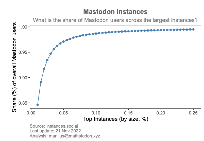
I’ve seen a bit of commentary that Mastodon isn’t really all that decentralized, as the distribution of users across instances follows a Zipf-like pattern (which I find unsurprising). This analysis from Manlio De Domenico tells the story: 97% of Mastodon users are on the top 5% of instances.
But I actually think that makes the case that decentralization is working well! Yes, there are some big instances with close to 1 million users. Aus.social, with around 20k users as of today, is ranked about 50th most populous instance according to instances.social. Discuss.systems, where @SystemsAppr lives, has just over 1200 users (around 400th). There are thousands of active instances, with new ones coming daily, so it’s hard for me to see this as excessive centralization. It will be interesting to see how this plays out if Mastodon continues to grow at its current rate. Certainly many instances are experiencing growing pains, as I’ve learned by following a few administrators.
Another interesting aspect of decentralization is how these instances sit on the underlying Internet infrastructure. As we discussed previously, one way in which the Internet has re-centralized is the heavy dependence on a few services such as Cloudflare, Fastly and Akamai; when one of these services has an outage, it affects huge chunks of the Internet. Here, again the news looks fairly promising to the extent that we have data.

At least we can say from the above that there isn’t a huge dependence on a small number of ISPs, and Cloudflare doesn’t appear to be responsible for more than 10% of Mastodon instances (although we can’t easily draw conclusions about CDNs from this data). You can also see that there are around 30k instances total in this data set, which seems pretty decentralized to me.
One aspect of Mastodon that should help it stay decentralized is the relative ease of moving from one instance to another. Many new Mastodon users are stressed out by the task of choosing an instance, a decision that isn’t required when signing up for a typical social network. While I recommend people look at things like stability and moderation policies, there’s clearly a risk of finding yourself on an instance that’s unsuitable for some reason. But migrating from one instance to another, and taking all your follows/followers with you (a real pain point when leaving a traditional social network) “just works” thanks to the design of ActivityPub and the Mastodon implementation. Kris Nóva, who runs the Hachyderm instance, wrote about her moving experience. (She’s also been livestreaming upgrades to Hachyderm’s infrastructure, a hugely educational experience.) Since users are free to move, new instances can attract users more easily, and there is no lock-in to instances that fail to perform as required.
I want to emphasize the central role that the ActivityPub protocol plays. “Mastodon” is doing a lot of work here as (a) the name for a social network (which uses ActivityPub) (b) the most common implementation of a server that implements ActivityPub, and (c) the name of a couple of mobile applications (clients) that let users talk to Mastodon instances. But just as there are lots of web browsers and web servers that implement HTTP, there are multiple ActivityPub implementations, both servers and clients. The story gets a bit complicated by the fact that some implementations of ActivityPub are offering a different service than Mastodon (e.g. Pixelfed is an image-sharing social network, BookWyrm is a social book-rating and reviewing service). But the existence of a stable, standard protocol (thanks W3C!) means that we have a solid foundation for innovation at multiple levels, be it in new clients, servers, or applications. And there is a form of resilience here: if, for example, the current Mastodon server implementation proves to be unsustainable for some reason, there’s nothing stopping developers from making new (perhaps better) implementations of ActivityPub–something that is already happening as noted above.
The existence of a stable protocol cuts both ways: inside a single organization, it’s easier to make substantial changes to a protocol or even replace it with something else (e.g. gRPC). Although that may not be as easy as it sounds once you have enough teams of developers trying to work independently and depending on stable APIs between components. But the history of the Internet tells us that well-specified protocols that encourage experimentation in how they are implemented and in the applications that use them can drive innovation and growth for decades. I’m optimistic that ActivityPub will be one of those protocols powering the future decentralized Internet.
It’s worth revisiting David Clark’s paper “The Design Philosophy of the DARPA Internet Protocol” for a reminder of how decentralization became a top-level design goal for the Internet. The history of the Fediverse goes back well before Mastodon. We also found some graphs and commentary on centralization of DNS. Finally, I was reminded of some little-known work by the networking pioneer Paul Francis on building decentralized Web search in 1995, which was thoroughly overtaken by Google with their relatively centralized approach in 1998. How different the world might be if that had taken off.
Typo: It's Bryan (with a y) Cantrill.
Hi. This is a great article. However, you may wish to consider using a bar graph instead of a pie chart, as pie charts have many problems in displaying quantitive information such as the list of percentages you present in the article. An excellent overview on this issue is here:
https://www.perceptualedge.com/articles/visual_business_intelligence/save_the_pies_for_dessert.pdf